TripSync
TripSync: Making Group Travel Planning Actually Collaborative
The Problem That Hit Home
I love traveling, but I hate planning trips. Not because I don't enjoy the anticipation—I do—but because somehow I always end up being the person doing 90% of the work while trying to consider everyone else's preferences, personality, and budgets.
Sound familiar?
Through user interviews, I discovered this frustration was universal. While 87.5% of people travel in groups, the planning burden typically falls on one person who becomes the unofficial "trip manager," drowning in decisions while everyone else just shows up and provides minimal input.
The core problem: Group travel planning creates an exhausting decision-making bottleneck for one person, while valuable input from other group members goes untapped.
My Role & Timeline
Solo UX Designer on a Springboard capstone project
May - August 2022 (4 months)
User Research • UX Design • UI Design • Prototyping
Discovery:
Why Planning Feels So Hard
I started with user interviews to understand how people actually plan trips (not how they think they should). Five interviews later, two clear pain points emerged:
Decision overload: Too many choices about where to stay, eat, and what to do
Communication breakdown: Group members struggle to share input effectively, leading to one person making all the decisions
Key insight: People wanted to collaborate, but existing tools like TripAdvisor and Wanderlog only let you share itineraries—they don't facilitate group decision-making or task distribution.
The Solution:
Shared Ownership, Shared Joy
TripSync creates a collaborative environment where:
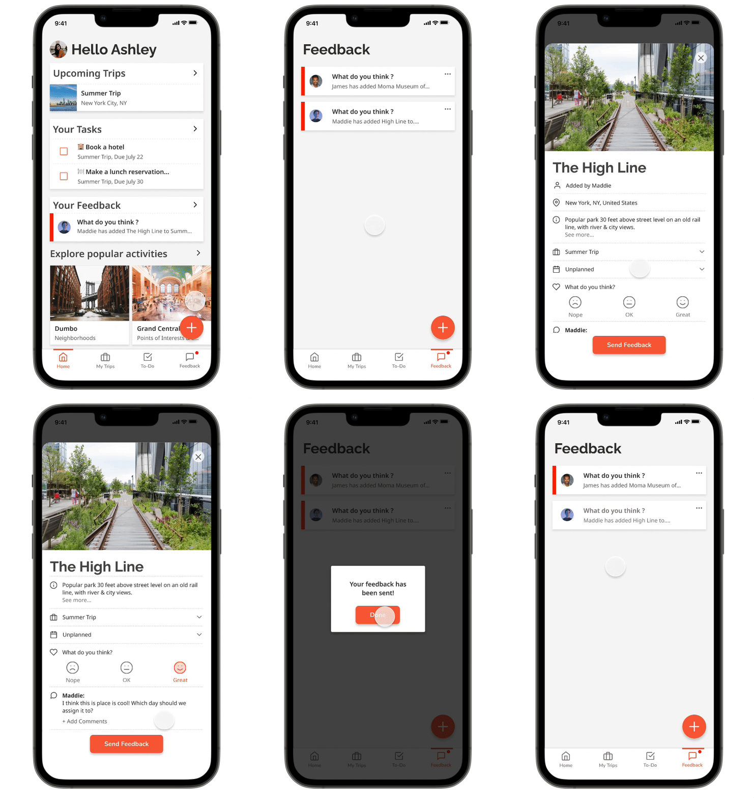
Everyone can contribute suggestions for activities and places
The group votes together on what to include (no forcing, just encouraging participation)
Tasks get distributed so one person isn't doing everything
Decisions feel shared rather than imposed
The goal wasn't to force collaboration, but to make it easy and natural.
Key Design Decisions
1. Mobile-First Approach
All interview participants used their phones 80% of the time while planning and traveling. Desktop wasn't even a consideration.
2. The Home Screen
That Actually Helps
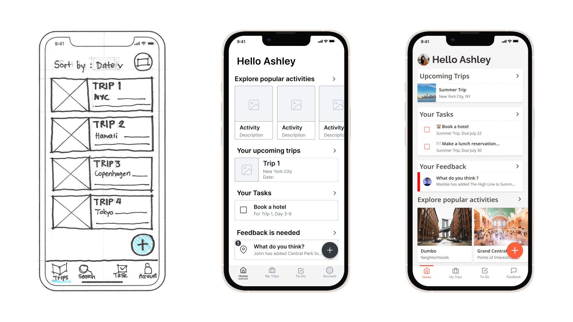
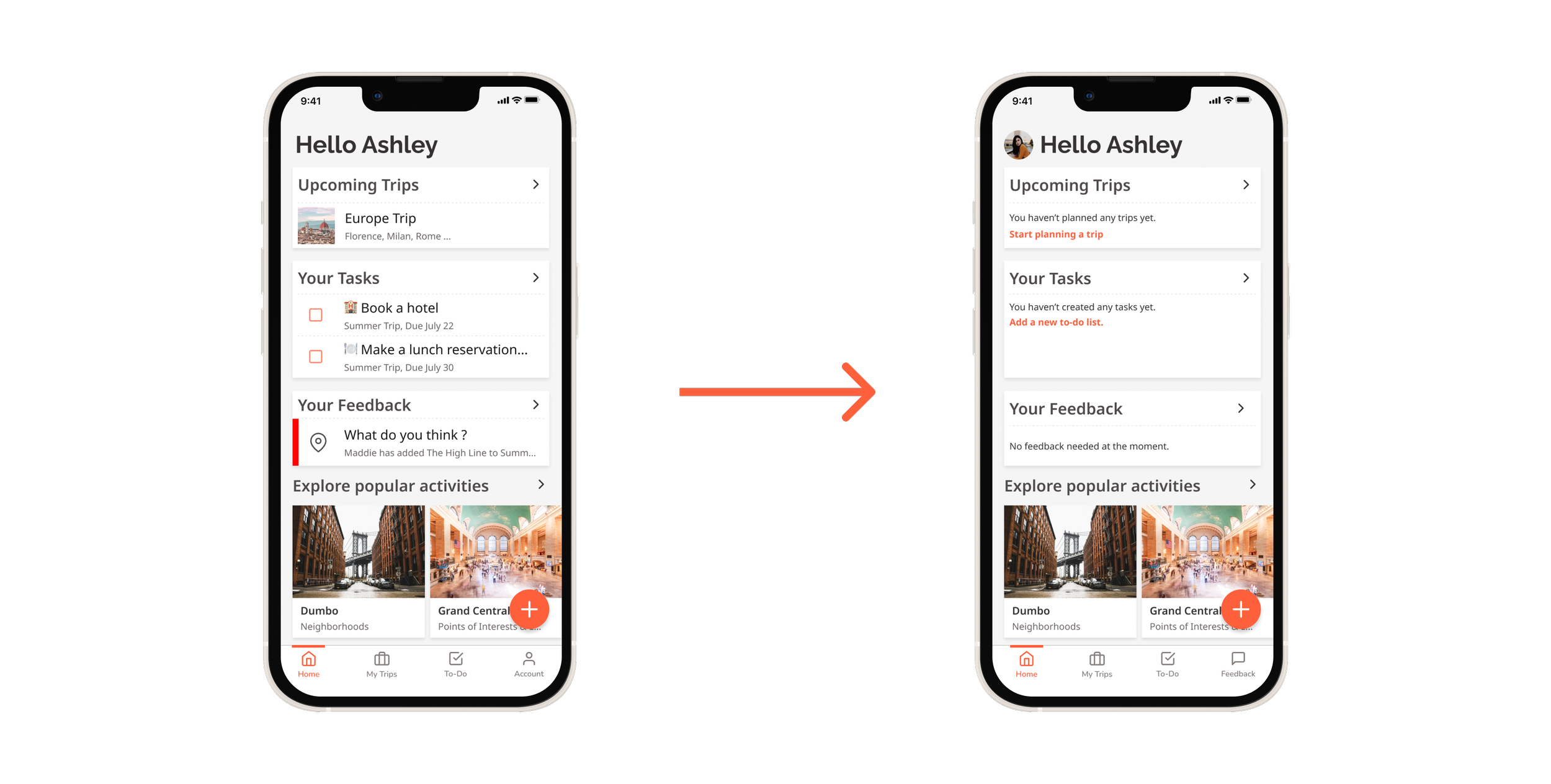
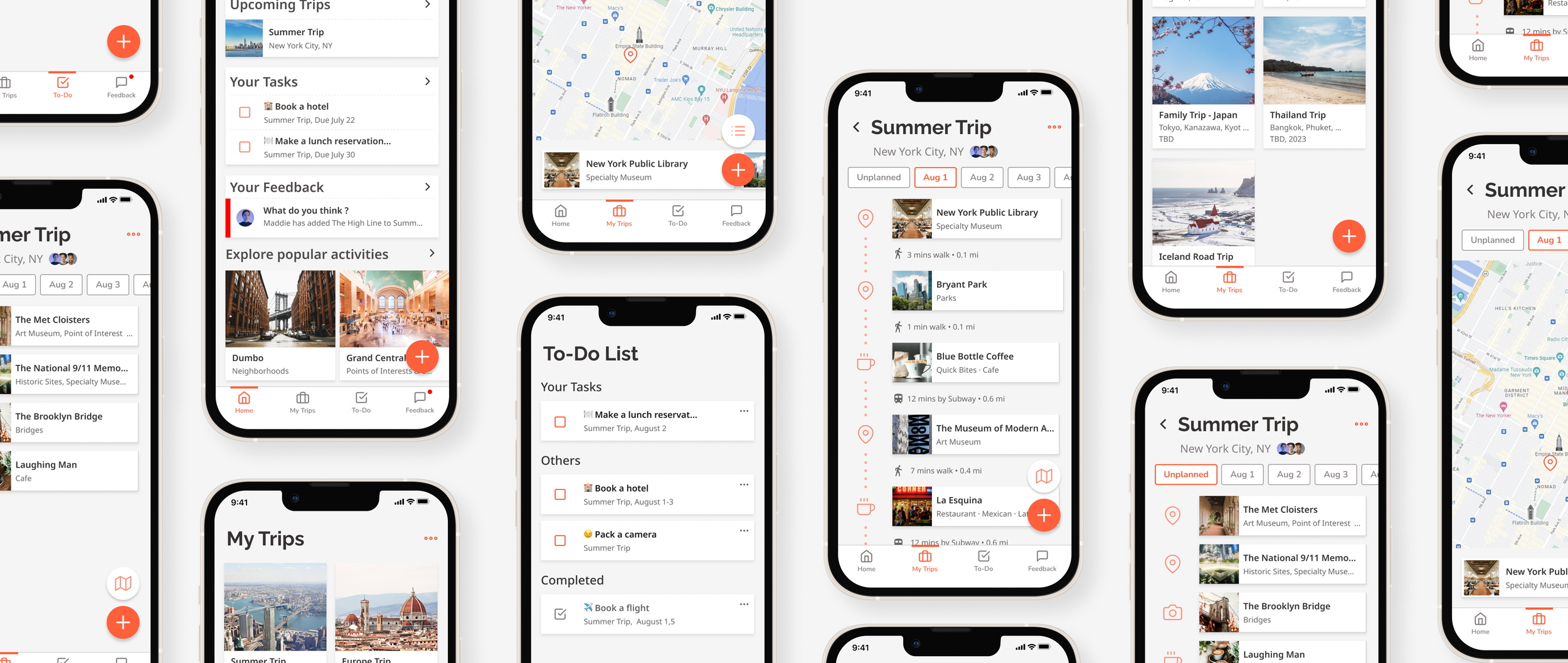
Instead of just showing your trips, the home screen highlights items that need your attention—friend suggestions to vote on, tasks assigned to you, feedback requests. It becomes your collaboration dashboard.
Introducing Home Screen
3. Separating Feedback
from Tasks
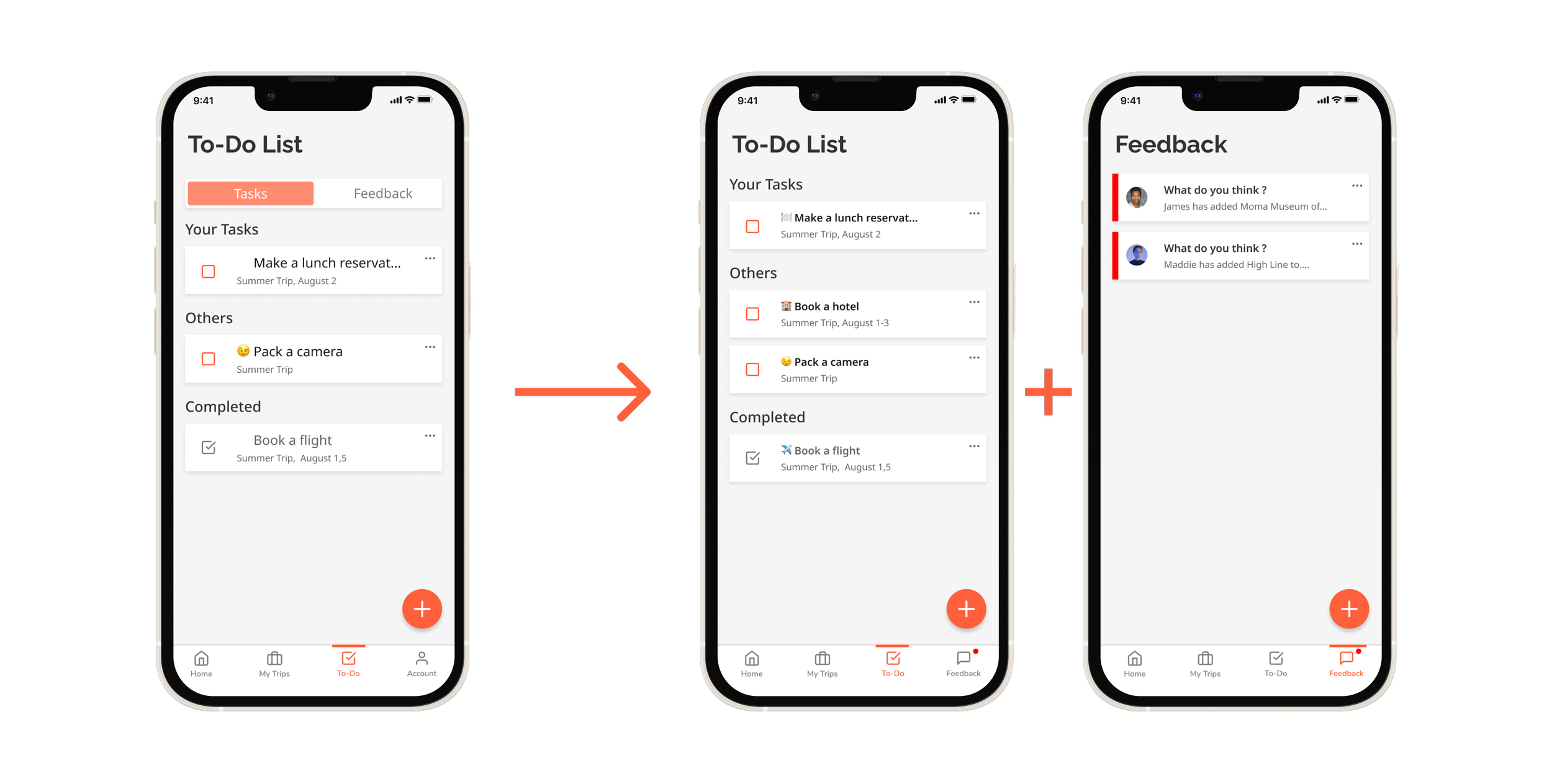
Initially, I buried the voting feature inside the to-do section. Users couldn't find it. Solution: I gave feedback its own tab in the bottom navigation. Problem solved.
4. Empty States That Teach
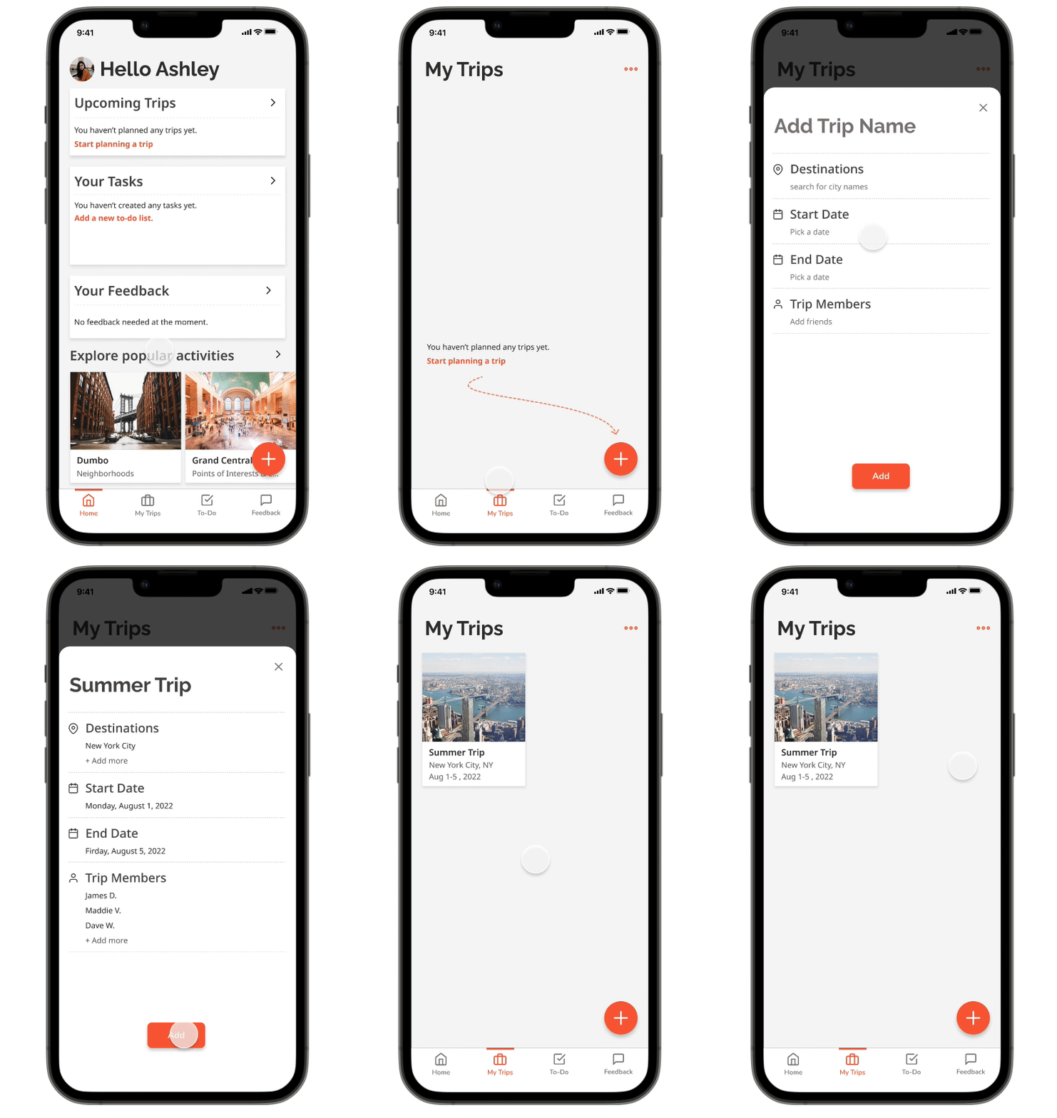
Since users create all the content, empty states became crucial onboarding moments. Instead of blank screens, I added gentle instructions that built confidence.
What I Learned
User testing is everything. I thought I could design intuitively, but users consistently surprised me. Two rounds of testing with 10 participants total completely transformed the app's usability.
Feature creep is real. Looking back, my MVP was way too complex. Map views? Really? I got caught up in what seemed cool rather than what solved the core problem.
Collaboration is complex. I designed a voting system without fully thinking through edge cases: What happens when something doesn't get enough votes? Who has final authority? These questions need deeper exploration.
If I Could Do It Again
Less features and more Psychology
I'd strip the features down to the absolute essentials and dig deeper into the psychology of group decision-making. What actually motivates people to participate in planning? How do you balance democratic input with practical decision-making?
The real challenge isn't building features—it's understanding human behavior in group dynamics.
The Impact
This project taught me that good design isn't about having great ideas—it's about testing those ideas against real human behavior and being humble enough to change course when users tell you otherwise.
Most importantly: I learned to fall in love with the problem, not my solution.
